|
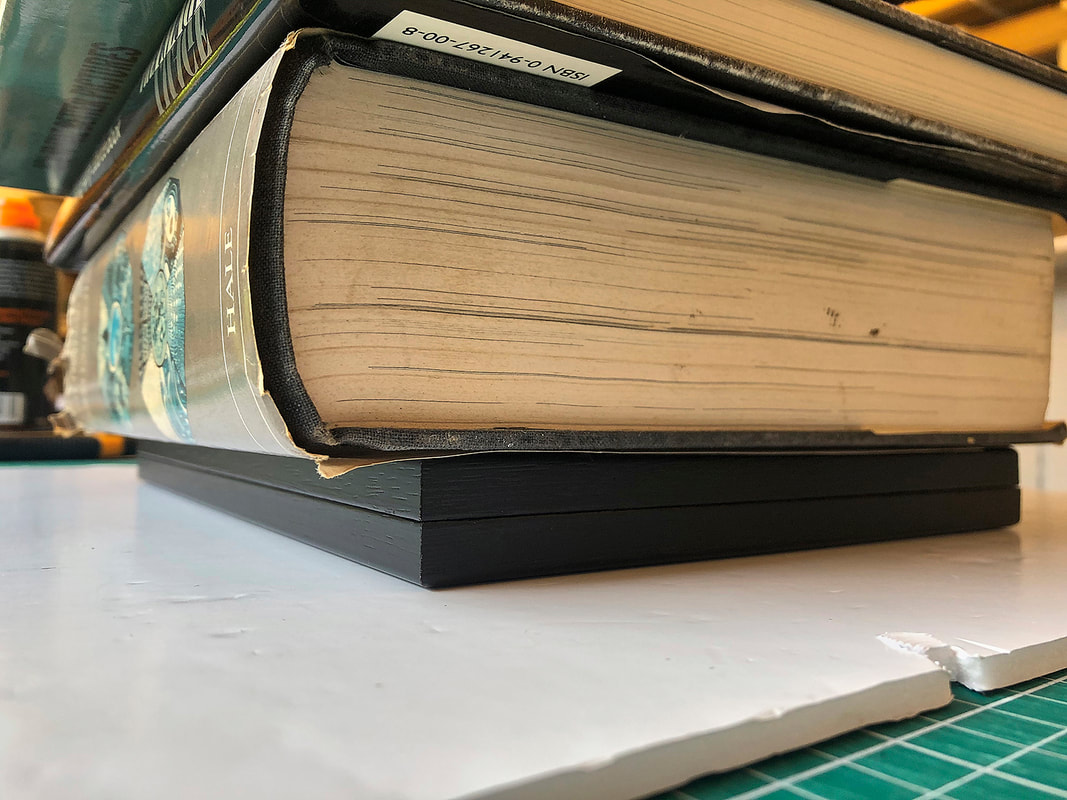
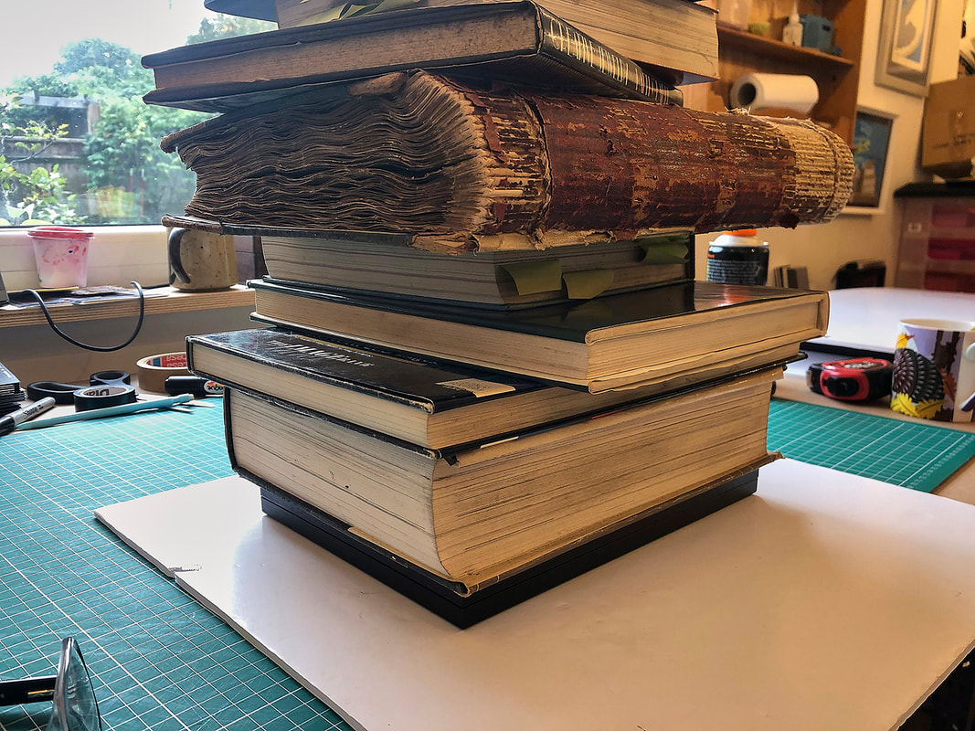
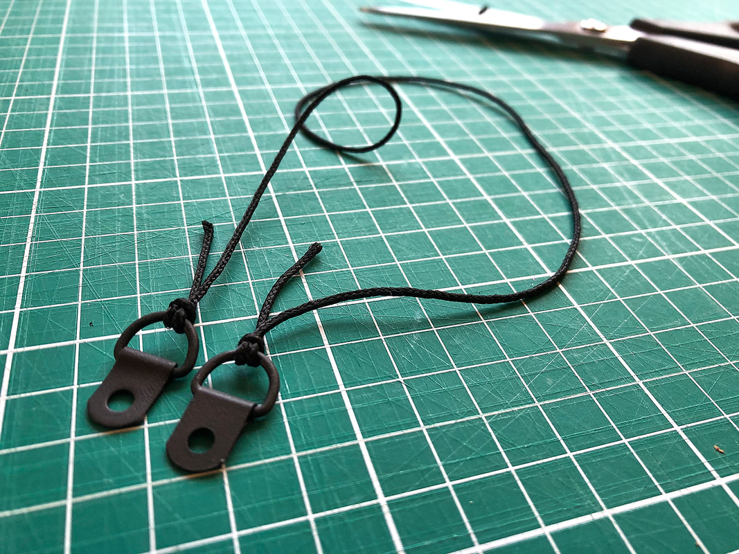
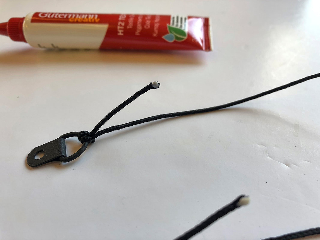
When I first put a blog category on my website, it was my intention to post at least once a month. Well, that didn't happen. But it's something I hope to rectify starting RIGHT NOW! So much amazing work comes through the workshop that it seems a shame not to share the great work my customers make or buy, their great vision for how it should look, the collaborations between us or the trust they put in me to make their art sing. Where better to start than with the most technically challenging job to ever come into my workshop! 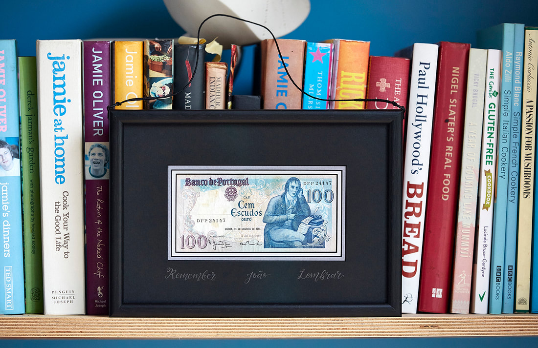 The front of a double-sided frame for an old Portuguese banknote. 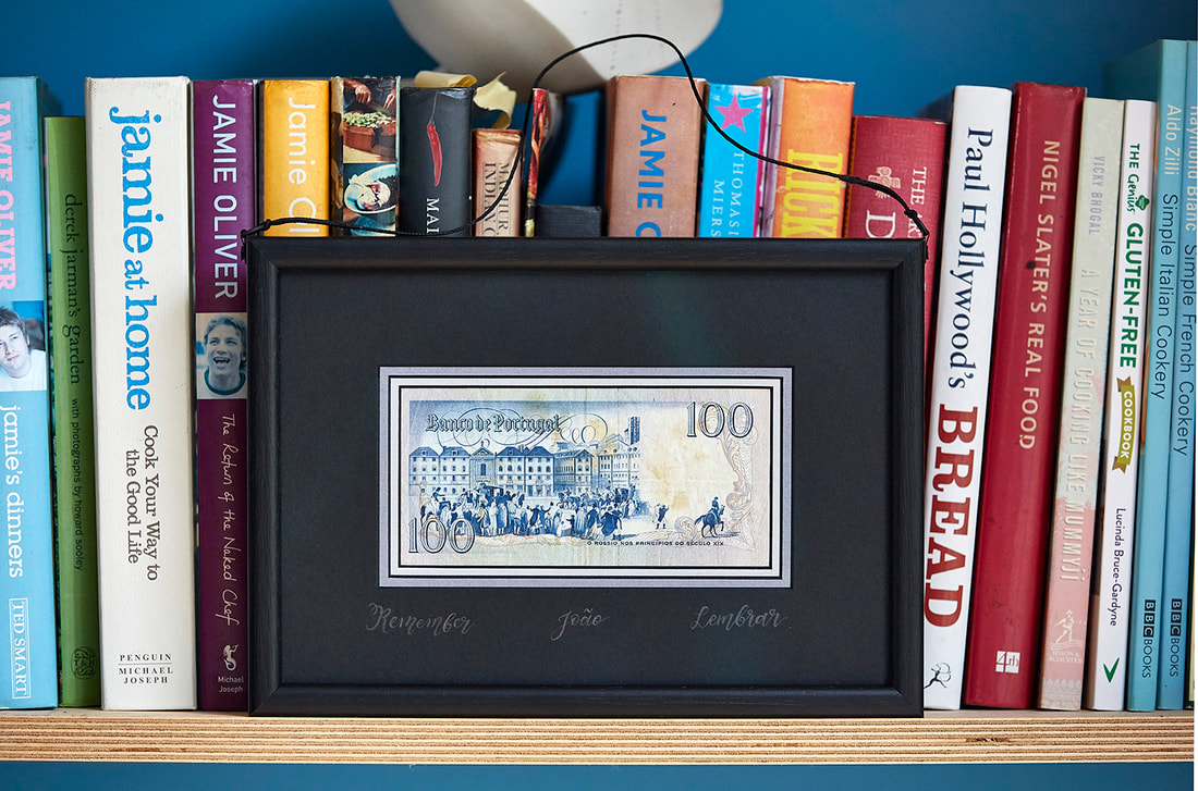 And the rear of the same double-sided frame The briefNormally collaborations with customers take a while to happen, they get to know how I work and gain trust in me. Rarer still are jobs where you are given free rein, I'd never met this customer before (I was recommended though). We had a long chat about this and that and then he produced the tatty old Portuguese Escudo banknote below and explained that I could do what I liked with it. With conditions... 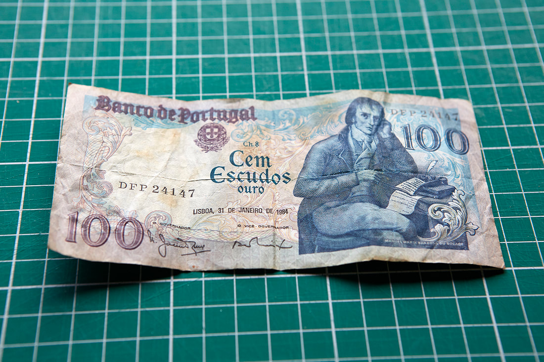 A 1984 one hundred Escudos note. My customer's only stipulations were... 1) That the note could be viewed from both sides. 2) That the frame had to have "the wow-factor" 3)That it contained three words 'João', 'remember' and ' lembrar' somewhere within the frame. I confirmed that, of course, this was all possible and my customer left in the knowledge that his banknote was in safe hands... The problemsThe more I thought about this job the harder it seemed! 1) I'd never made a double-sided frame before... 2) One person's 'Wow" is another person's gaudy/boring/clichéd/OTT etc 3) My handwriting is appalling! The solutionFirst things first, it was time to get that banknote looking a little less ragged! 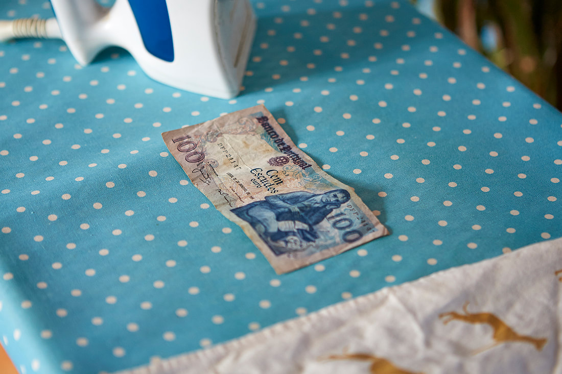 Tatty banknote before ironing. Checking first that the note wasn't a polymer note (too old) I selected a low temperature on the iron and crossed my fingers! 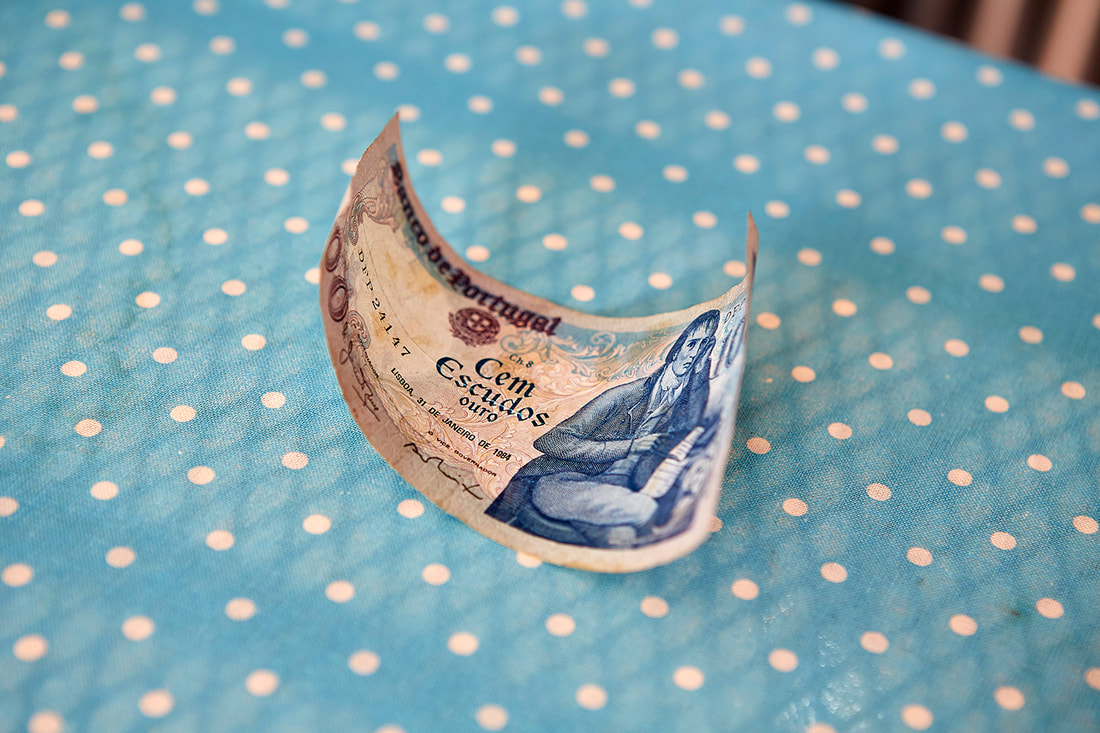 Banknote after ironing. It looked a whole lot better after even a quick iron, but it made it curl up. At this point I decided a press was in order.  Pressing banknote prior to framing. The note was carefully placed between the pages of a book... 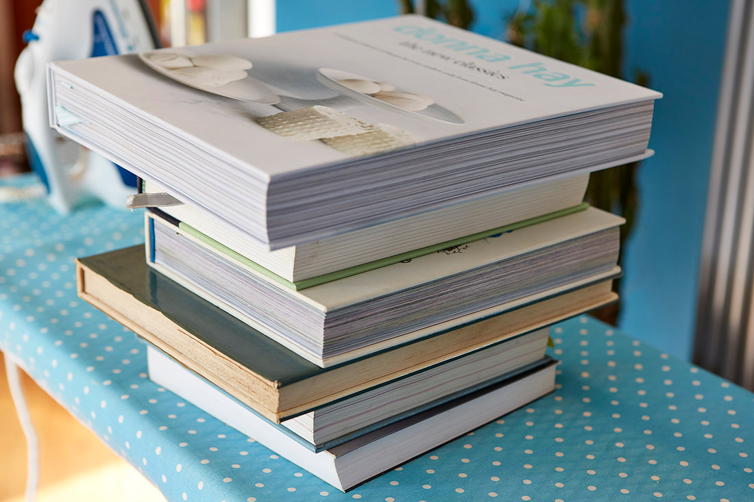 Big pile of heavy books, pressing the banknote! ...And then a big pile of heavy books was placed on top. With the simple work done, I put my mind to the rest... I knew that I couldn't do the writing my customer wanted myself, so I need to find a caligrapher for the job, but before any of that could be done I need to work out what they would write on, how best to make it viewable from both sides and what would give the job the WOW factor... I'd thought about so many options that I was going round in circles, finally I decided that I wouldn't try to pick out colours from the note itself to include in the frame or mount but would instead do something more classic to compliment the note. In fact, I'd thought about it so much that the solution came to me in a dream! In my dream the note was framed with a simple black moulding and mounted using a thick black core black mountboard. 'Brilliant' I thought when I awoke and set to work sourcing the materials. But... I could only find white core thick black mountboard which wouldn't work nearly so well. Back to the drawing board. I found the perfect black moulding to use in the workshop which proved that a thick mountboard would have the perfect depth and as I couldn't source what i wanted I decided to stack 3 normal depth mountboards on top of each other. After playing around with several combinations, I found one I really liked. All black core - one a light grey, a mid-grey and then the all black on top. I'd done some scribbling on the black mount and noticed how subtle pencil was on it, In certain lights it almost disappears altogether and in others it looks almost white. I found a brilliant calligrapher (thanks for going the extra mile Laura - www.lauralovesletters.com) who really understood the brief and then everything really started to come together!  Testing out pencil calligraphy on mountboard. 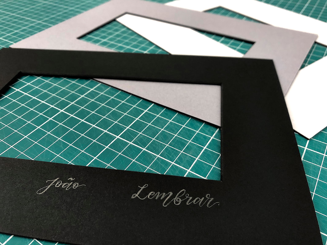 The finished calligraphy on black mount, with the other two layers in the background 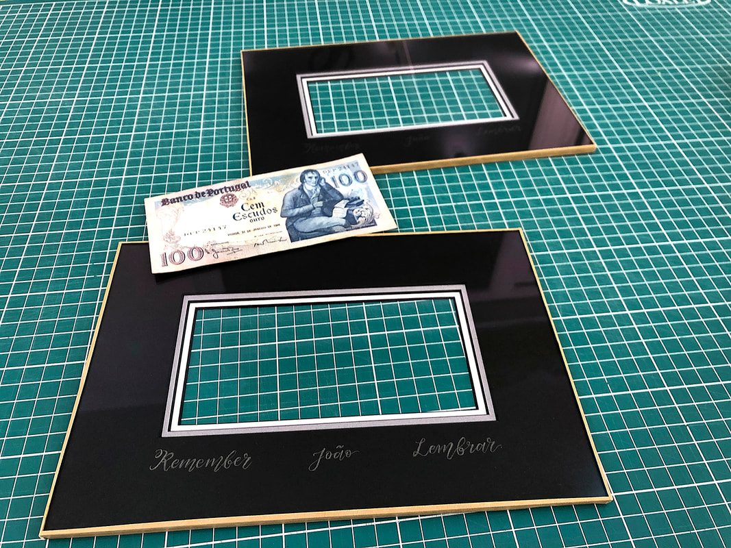 Sealed mount packages, ready for the banknote to be added. Now the three mounts (well, 6 if you count both halves of the frame!) were ready for the addition of anti-reflective glass and sealing in the same way as a normal mount/glass package. 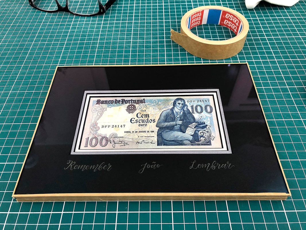 Sealed mount and glass package, with banknote sandwiched between six layers of mountboard and two layers of anti-reflective glass. It was now time to add the moulding, the frame. Two identical frames were made, one for each side. I still wasn't 100% sure that the package of glass and mountboard would fit snugly into the frame. As it turned out, there was slightly too much wriggle room so decided to wrap a couple of layers of black tape to the edges to make it more secure within the frame. 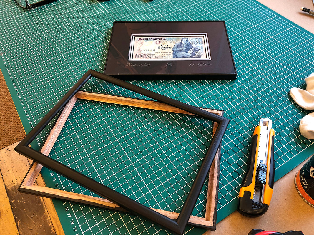 Black tape added to the edges of the mount and glass package ready to go into the double frame. 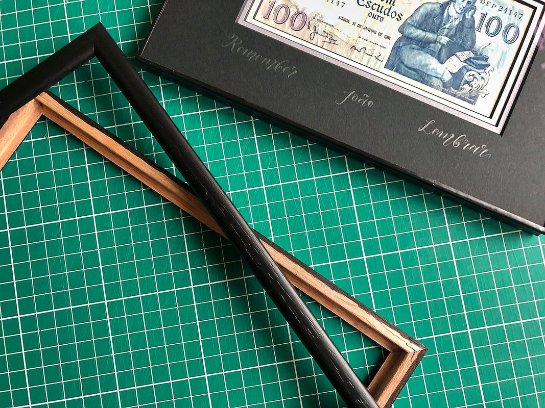 Frame ready to put together! When I mocked up the frame I noticed that the wooden side which would normally be invisible at the back of the frame could be seen at the join. The only solution I could find to this was to go around the edges with marker pen. It would never be a seamless join as it was two frames joined together but it was all black, rather than having little bits of light brown wood peeking out between the black. Then it was time to glue the two halves together and get out the big pile of heavy books again! The hanging system was another headache. With a 'normal' one-sided frame the hanging system of D-rings with cord (my preferred method, whether the D-rings are screwed into the moulding, or riveted into the back board - there are many variations (I can feel another blog coming on...)) it's all hidden at the back of the frame where it's not seen. With a double-sided frame there is no choice but to have the hangings on show. Most D-rings are nickel or brass so I sprayed some black with the toughest paint I could find and bought some black cord (thanks for the advise moresewing.co.uk). I then used my usual knot to attach the cord to the D-rings and then, rather than taping the short end to the rest of the cord as I normally would (to keep it tidy, even though it's not on show) I glued it and then used cotton thread to bind over the join. It took some practice and it's the part of the frame I'm not overly happy with... And then came the tense wait for the customer to come and collect his frame... Thankfully he really loved it and it is on it's way to Portugal where, with any luck, the 80 year old recipient (it's his birthday present) will love it just as much! And breathe...
1 Comment
|
Archives
February 2022
Categories
All
|

 RSS Feed