ED WATTS FRAMING
|
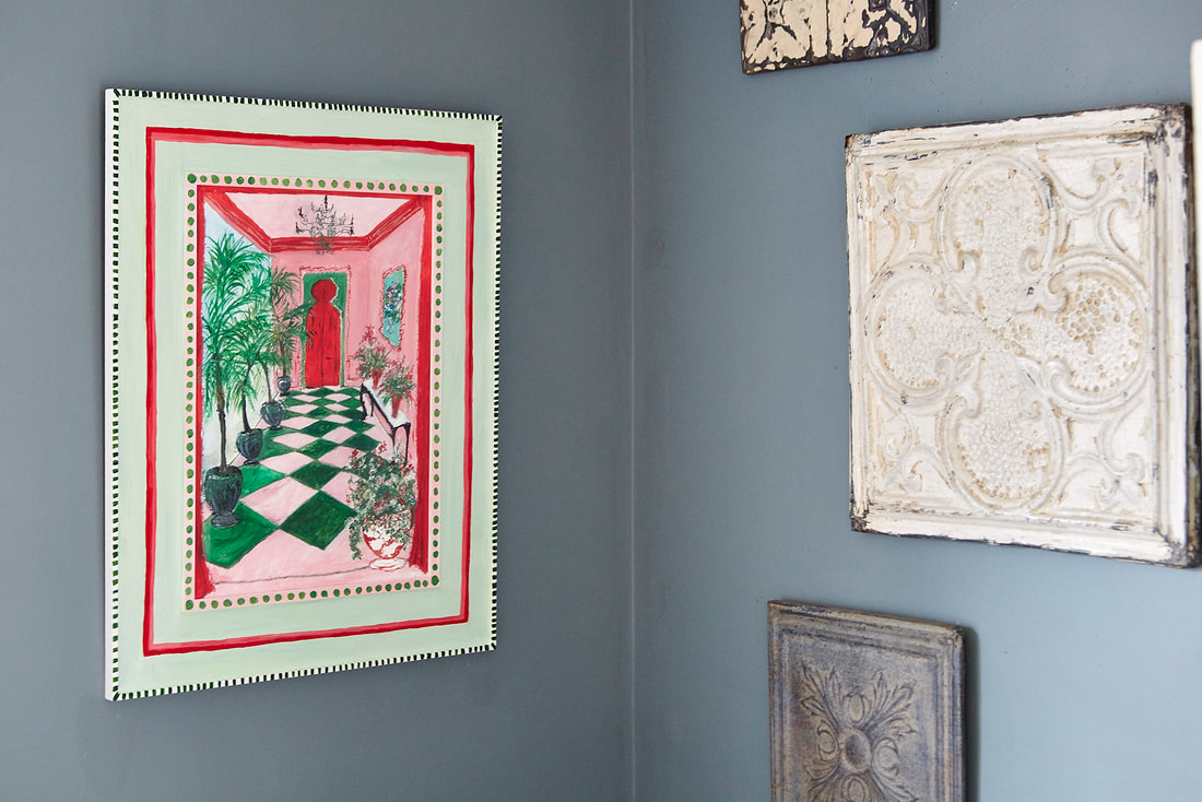
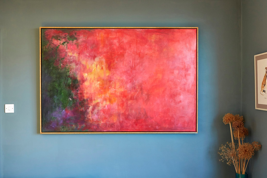
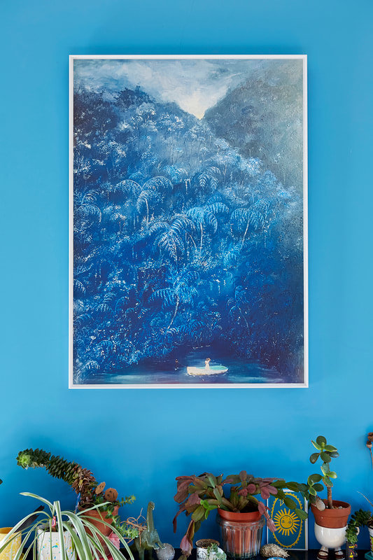
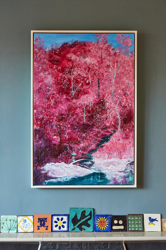
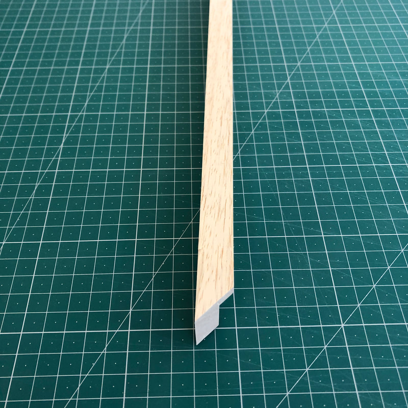
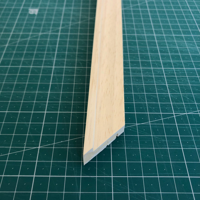
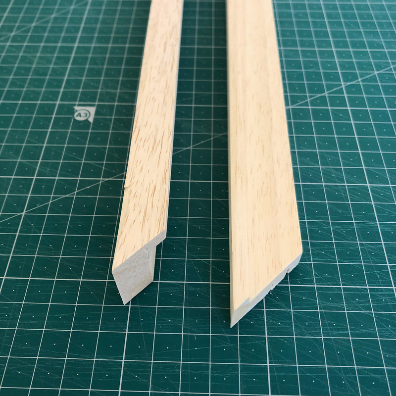
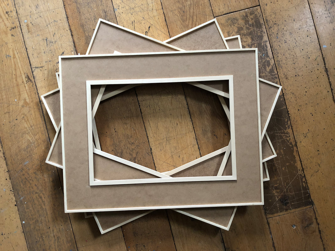
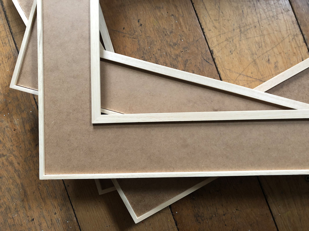
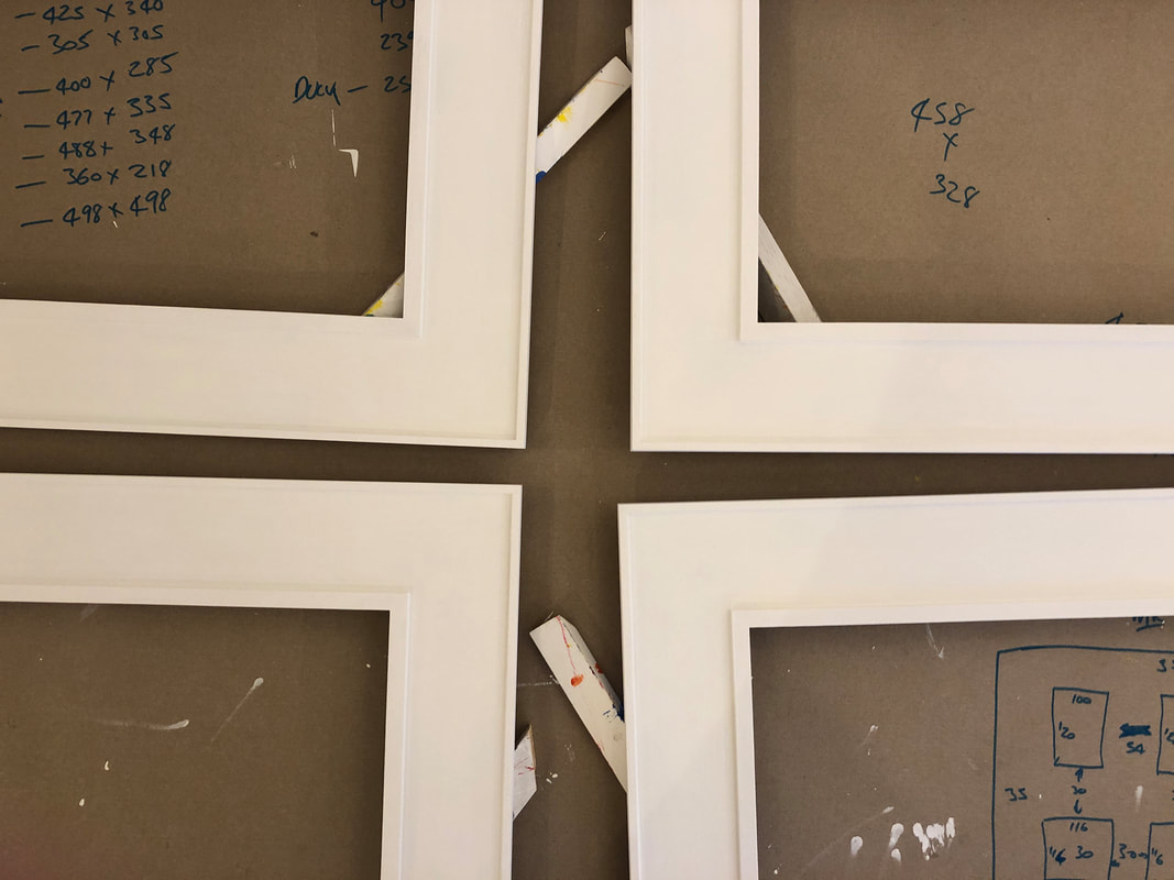
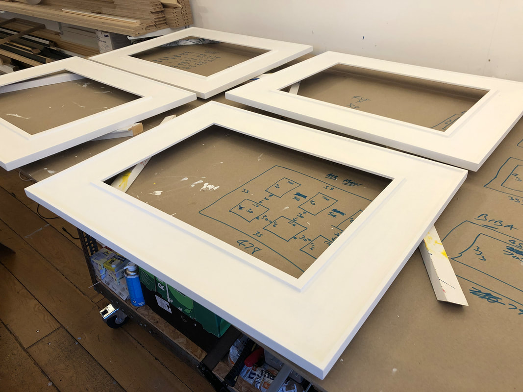
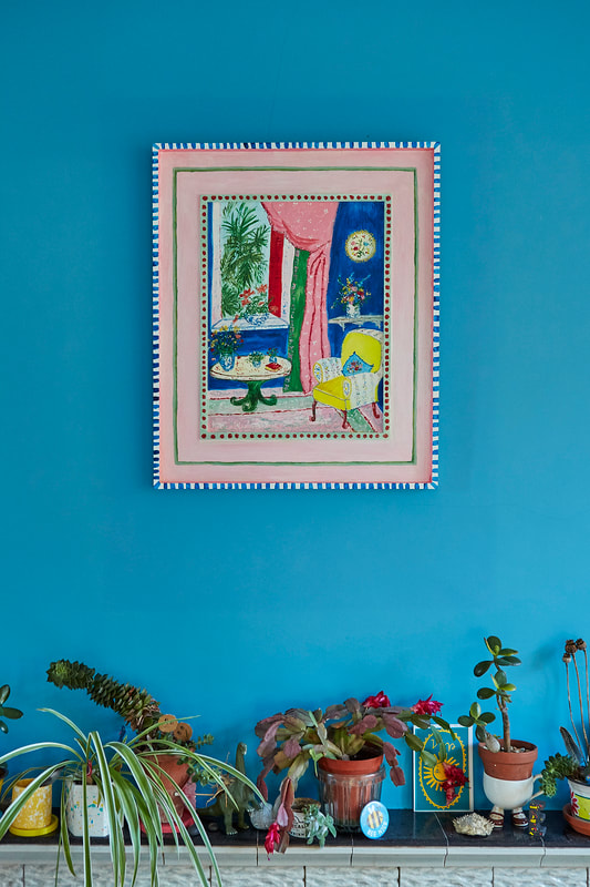
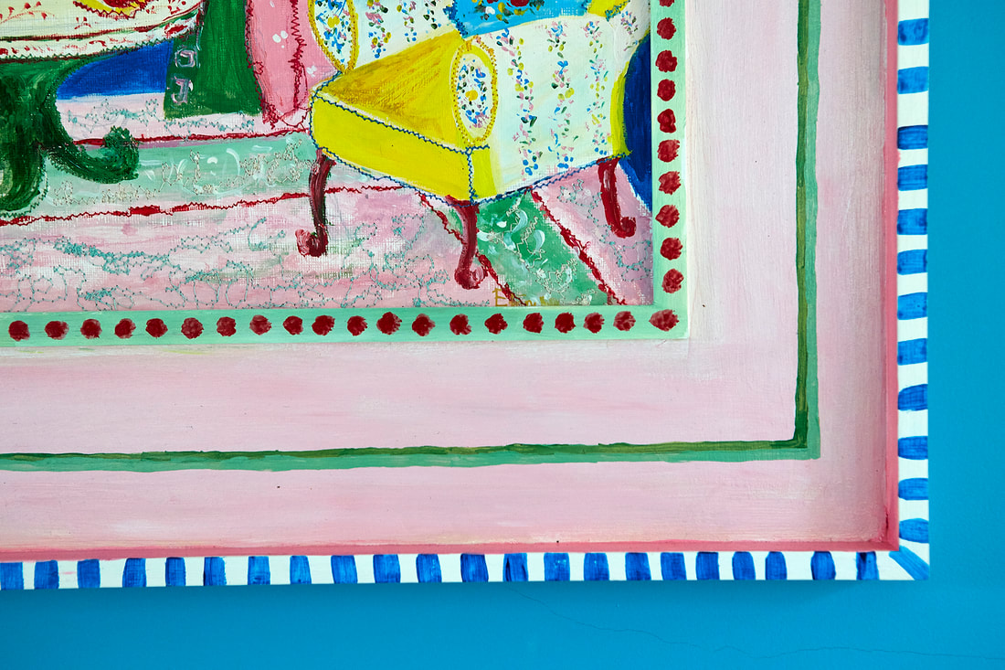
'From the Sublime to the Colourfully Ridiculous' was the apt title for Worthing artist Liz English's show at Colonnade House! I had the pleasure of framing many of the pieces from large canvas tray frames and white inset frames for prints below... So far, so pretty standard stuff, lime waxing, oak wax staining etc. But then came the 'Ridiculously Colourful'. No, wait, thats wrong! 'Colourfully Ridiculous"! Is there a difference? I'm not sure! Anyhoo, Liz's paintings have titles like 'Mad in Marrakech', 'Step Away From the Canvas Madam', and my favourite 'The Day Homer Simpson and Matisse came for tea at Cath Kidson's' Hahahahaha, brilliant! They're paintings that bleed from the original into the frame. It was a real collaborative process, it needed to be easy for Liz to take away and paint, and return for me to fit everything together and easy for me to make (#itwasntreally). A lot of the time in framing, what looks easy and effortless is very time consuming and fiddly, but so, so worth it for the final result. So how were they made? Well you take a standard obeche moulding (this is from Wessex Pictures 16mm wide, 27 deep) ... And turn it round the wrong way, like a tray frame -I do it for @danielagallery's wonderful collages and others. It works really well on shallow artworks... And together... Once the outer frame is made (here the border from painting to outer edge was 80mm) then a 2mm MDF sheet with cutout for the painting (obvs) is glued into place - 8 clamps per frame, leave for 24 hours to cure fully. Then cut the spacers (what the painting will sit in - in this case a Rose & Hollis obeche 12mm x 4.5mm spacer) and glue and clamp them in place. Then you have this... Some filling and sanding aside, they're ready to prime... Then they're ready for Liz to work her magic on them, once that's done all I have to do is fix the painting in the frame and add the hangings. And what beauties they become, it's like I give Liz some dull old caterpillars and she brings back beautifully colourful butterflies!!!
1 Comment
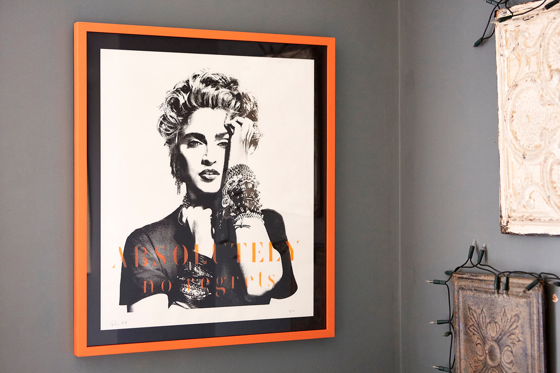
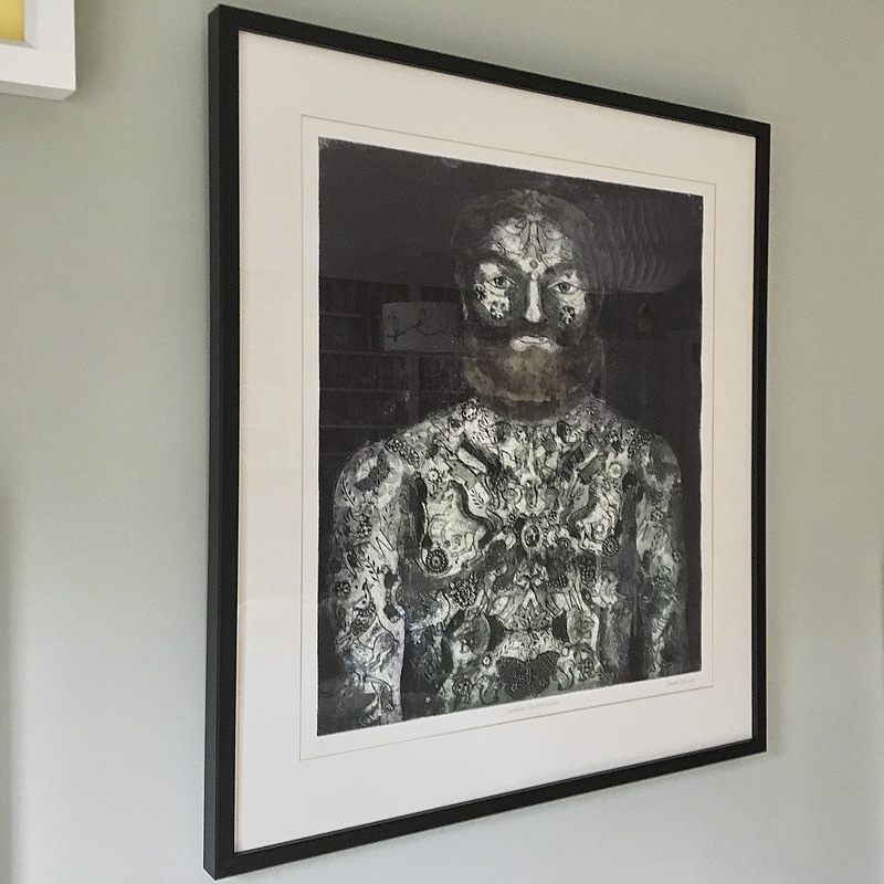
When my customer, Sophie, first brought this print into me, she wanted the frame to match a couple that she had already, with a white mount and white frame.
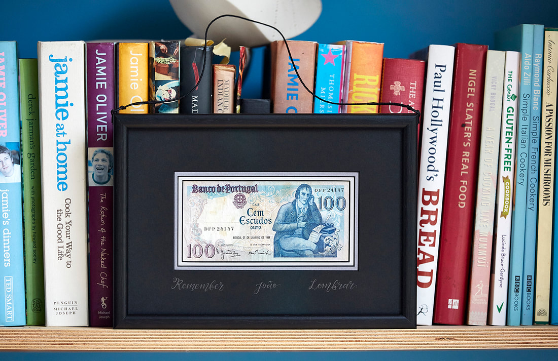
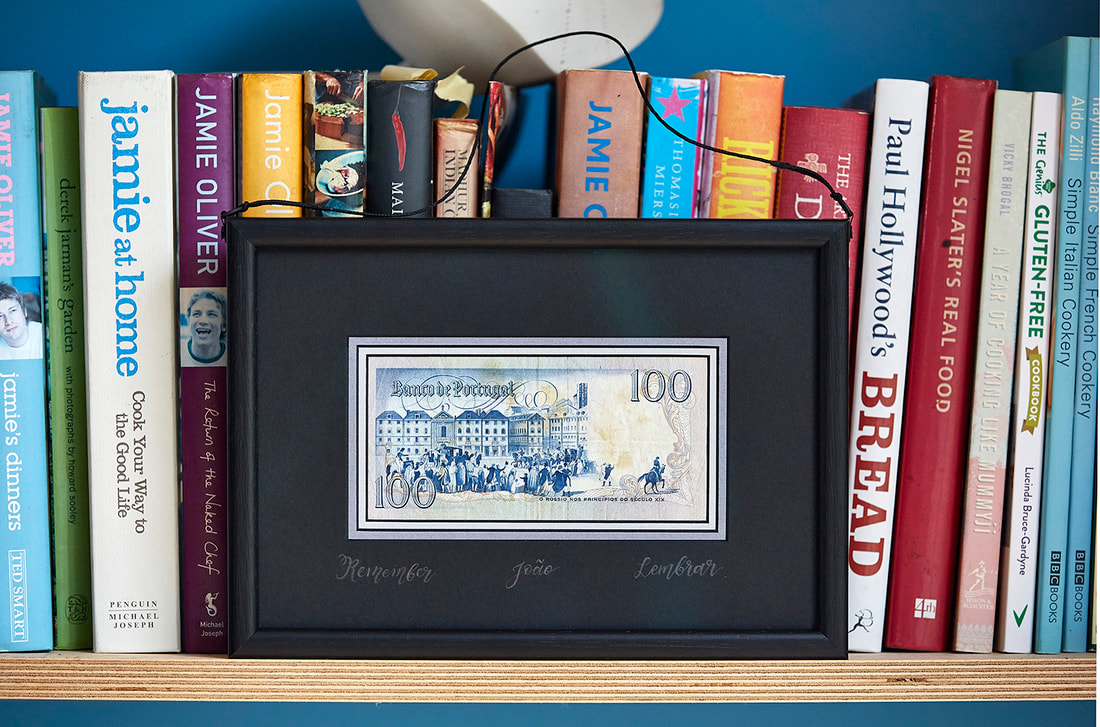
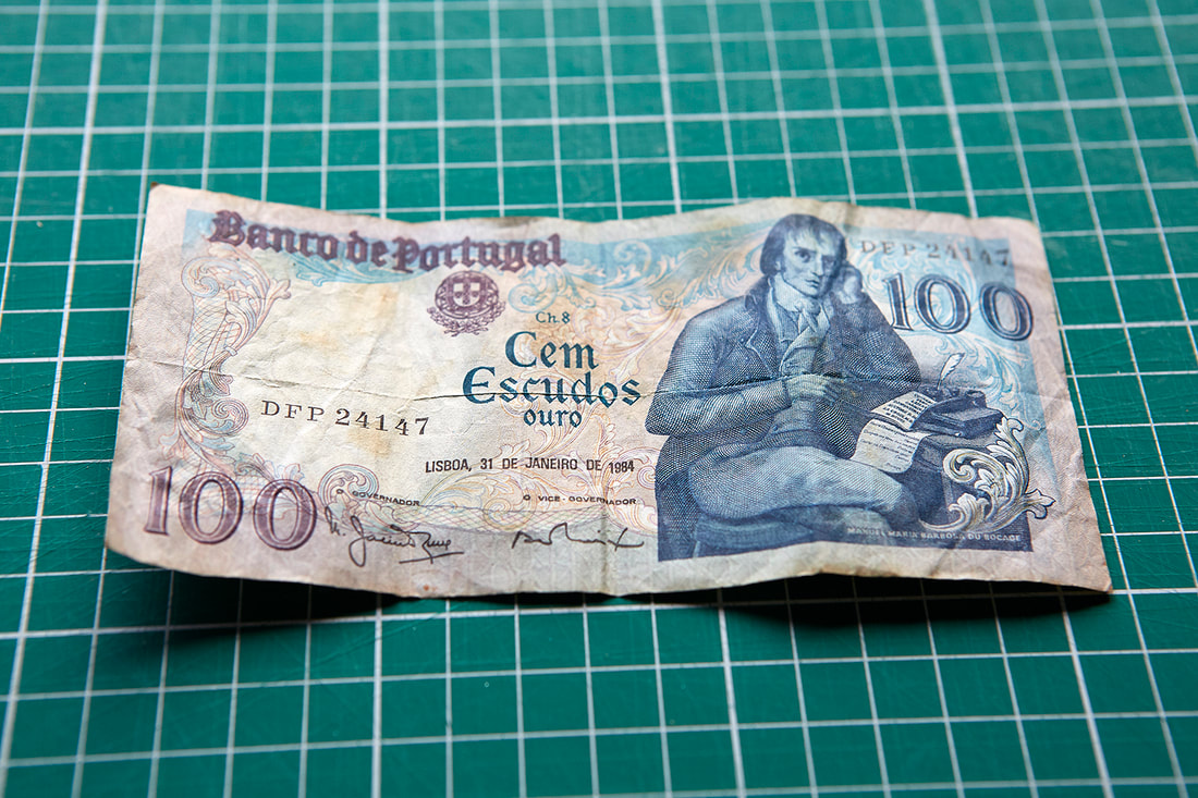
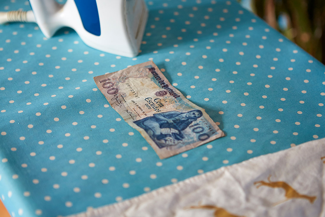
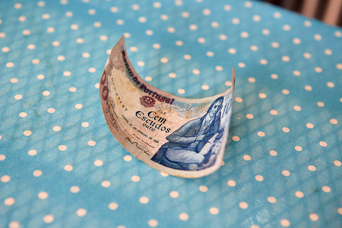
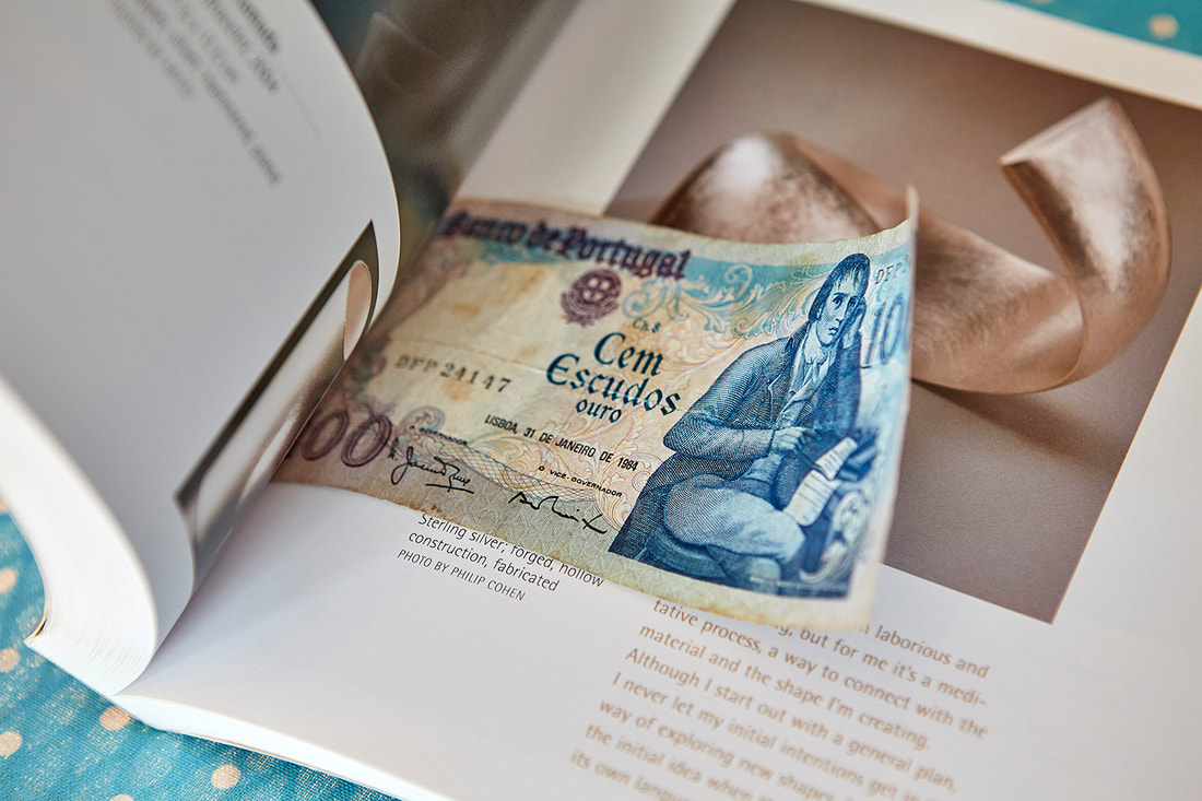
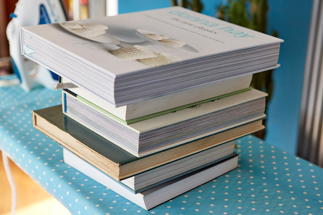
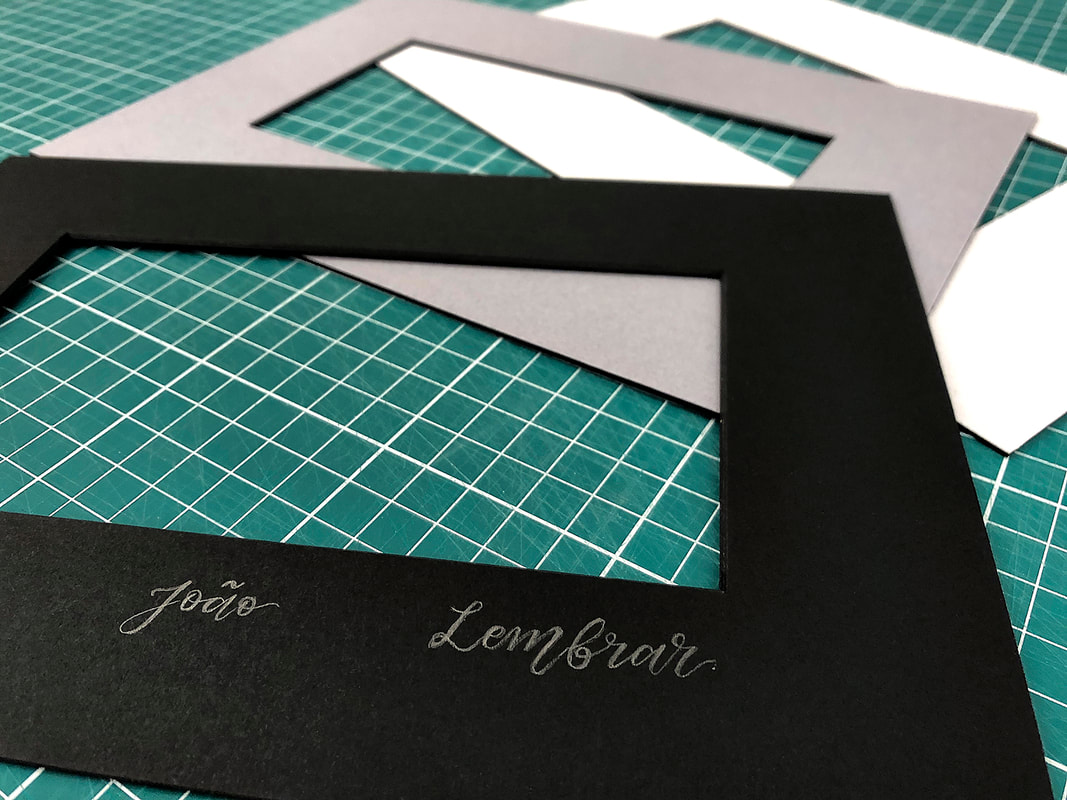
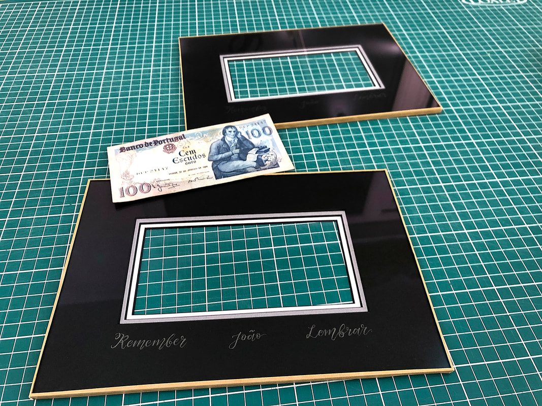
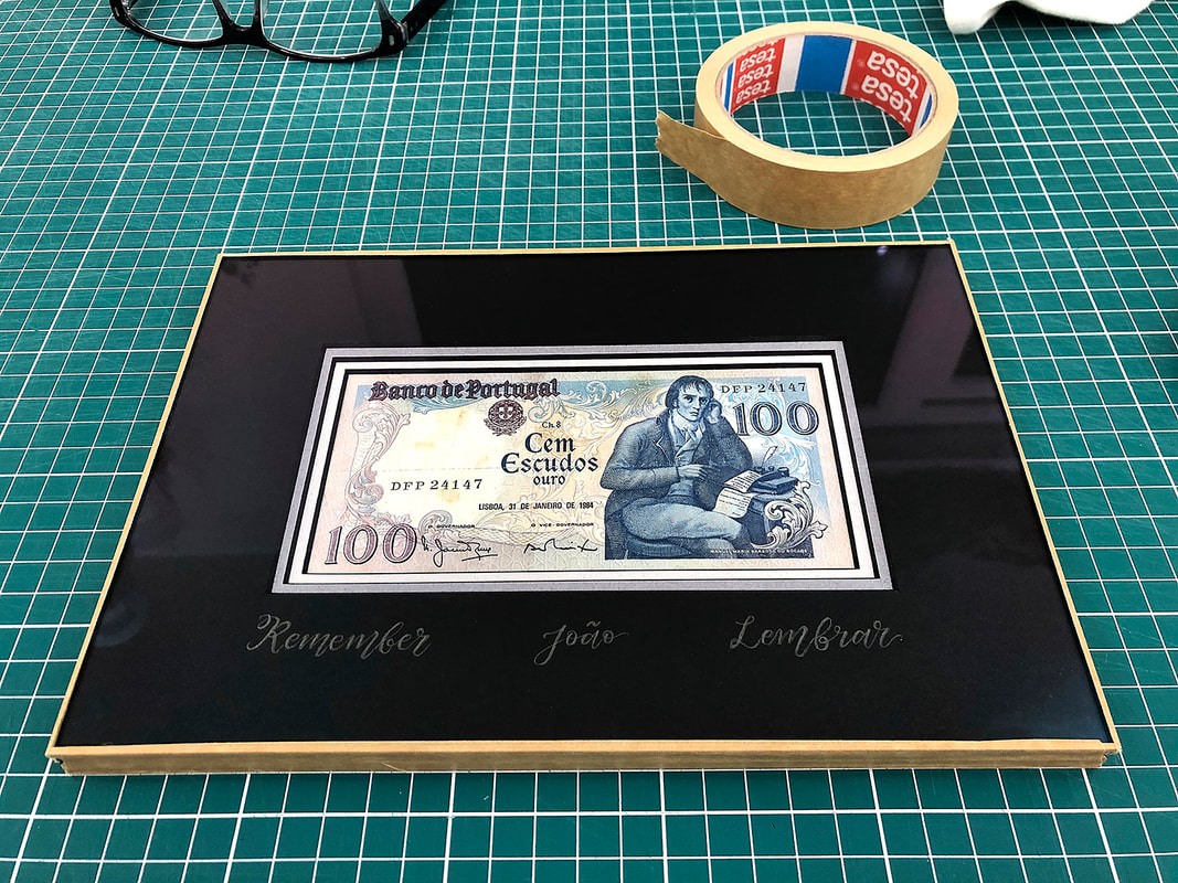
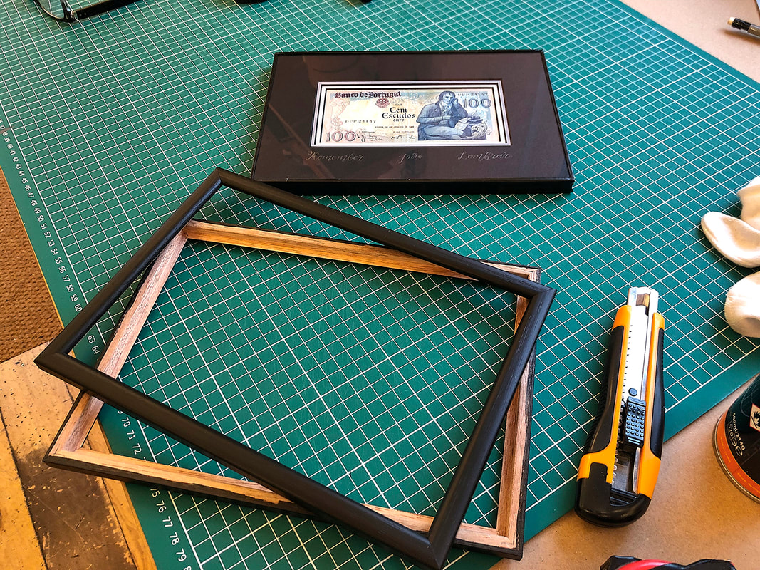
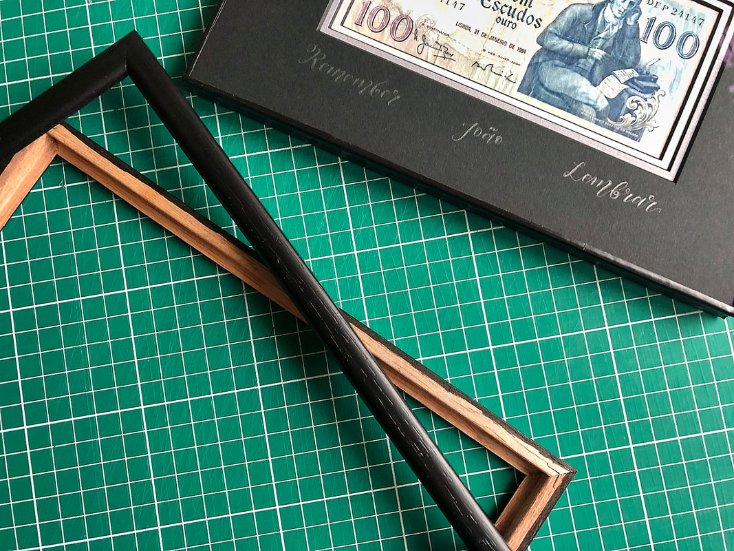
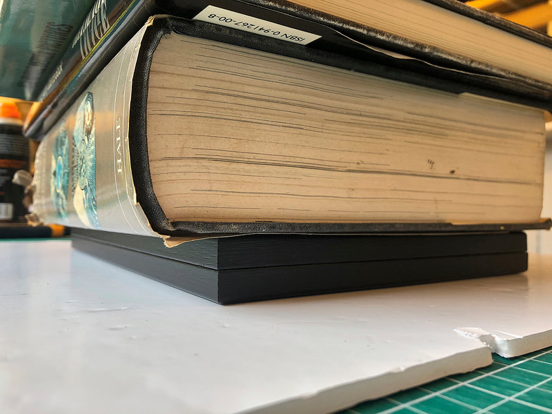
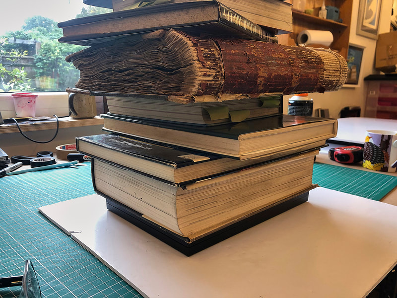
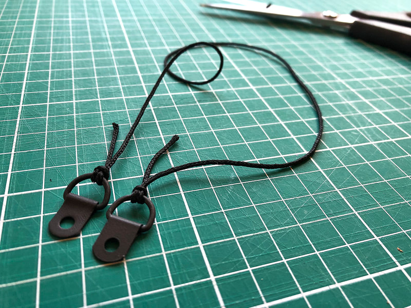
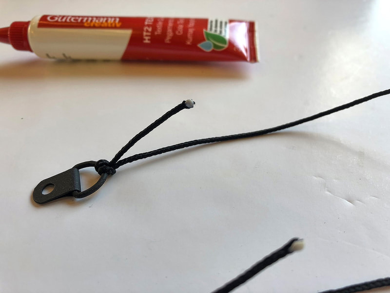
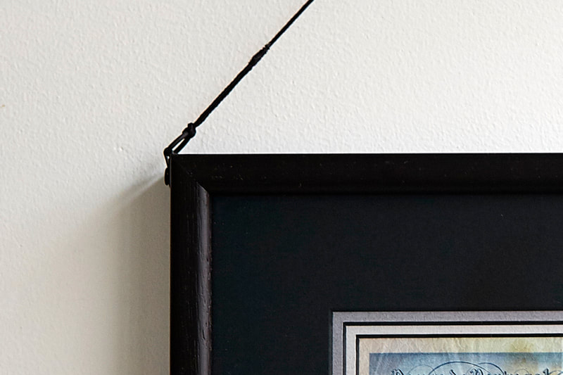
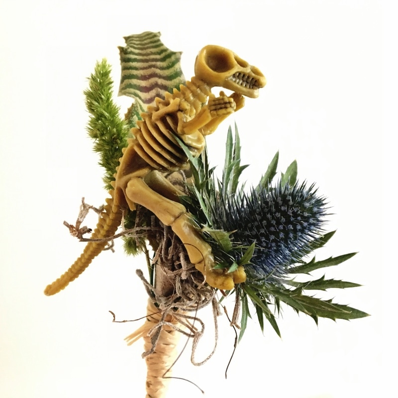
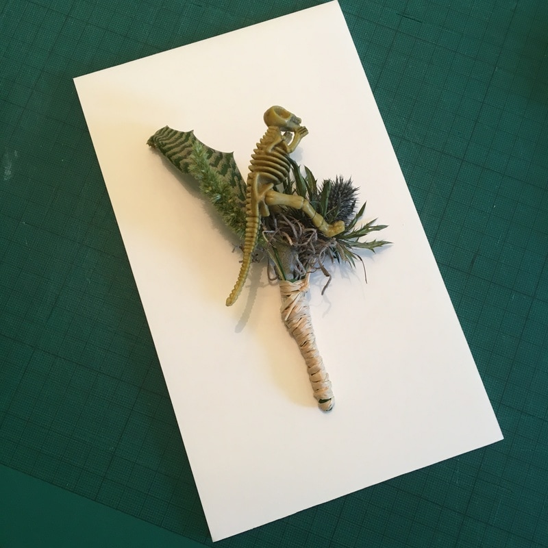
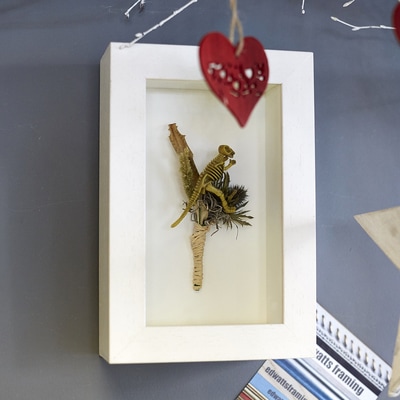
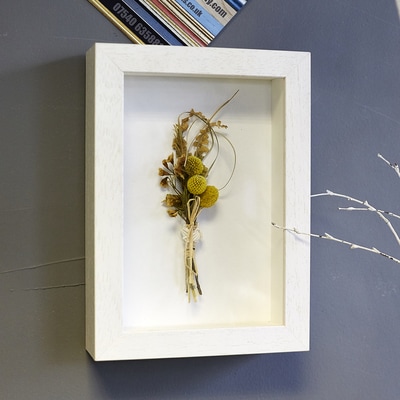
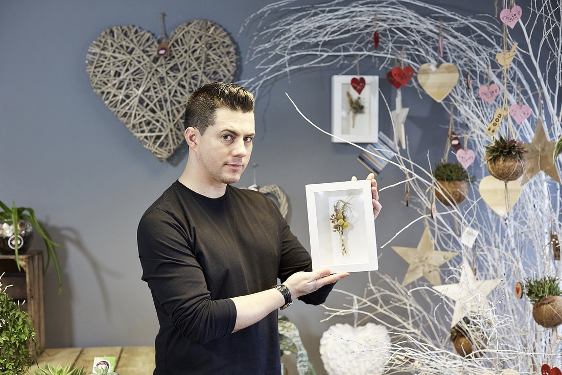
But the more I looked at it the more I thought this wasn't really going to do it the justice it deserved! A simple white frame and mount would have looked just fine, but in view of legend and Madonna's character I thought it needed to be much bolder! I talked it through with Sophie and her initial response was "that sounds expensive!?" And hand painting is obviously more expensive than an off-the-peg moulding due to the time it takes, but it's not prohibitively so. I worked out a price and it was all systems go. We decided on a black core black mount for added drama and to match the colour of the legend to Mylands 'Lolly Pop' paint (I so love the colour I've just finished painting a couple of frames for myself! - more of this in another post). How did my customer react to the frame? "Absolutely no regrets", of course! When I first put a blog category on my website, it was my intention to post at least once a month. Well, that didn't happen. But it's something I hope to rectify starting RIGHT NOW! So much amazing work comes through the workshop that it seems a shame not to share the great work my customers make or buy, their great vision for how it should look, the collaborations between us or the trust they put in me to make their art sing. Where better to start than with the most technically challenging job to ever come into my workshop! The briefNormally collaborations with customers take a while to happen, they get to know how I work and gain trust in me. Rarer still are jobs where you are given free rein, I'd never met this customer before (I was recommended though). We had a long chat about this and that and then he produced the tatty old Portuguese Escudo banknote below and explained that I could do what I liked with it. With conditions... My customer's only stipulations were... 1) That the note could be viewed from both sides. 2) That the frame had to have "the wow-factor" 3)That it contained three words 'João', 'remember' and ' lembrar' somewhere within the frame. I confirmed that, of course, this was all possible and my customer left in the knowledge that his banknote was in safe hands... The problemsThe more I thought about this job the harder it seemed! 1) I'd never made a double-sided frame before... 2) One person's 'Wow" is another person's gaudy/boring/clichéd/OTT etc 3) My handwriting is appalling! The solutionFirst things first, it was time to get that banknote looking a little less ragged! Checking first that the note wasn't a polymer note (too old) I selected a low temperature on the iron and crossed my fingers! It looked a whole lot better after even a quick iron, but it made it curl up. At this point I decided a press was in order. The note was carefully placed between the pages of a book... ...And then a big pile of heavy books was placed on top. With the simple work done, I put my mind to the rest... I knew that I couldn't do the writing my customer wanted myself, so I need to find a caligrapher for the job, but before any of that could be done I need to work out what they would write on, how best to make it viewable from both sides and what would give the job the WOW factor... I'd thought about so many options that I was going round in circles, finally I decided that I wouldn't try to pick out colours from the note itself to include in the frame or mount but would instead do something more classic to compliment the note. In fact, I'd thought about it so much that the solution came to me in a dream! In my dream the note was framed with a simple black moulding and mounted using a thick black core black mountboard. 'Brilliant' I thought when I awoke and set to work sourcing the materials. But... I could only find white core thick black mountboard which wouldn't work nearly so well. Back to the drawing board. I found the perfect black moulding to use in the workshop which proved that a thick mountboard would have the perfect depth and as I couldn't source what i wanted I decided to stack 3 normal depth mountboards on top of each other. After playing around with several combinations, I found one I really liked. All black core - one a light grey, a mid-grey and then the all black on top. I'd done some scribbling on the black mount and noticed how subtle pencil was on it, In certain lights it almost disappears altogether and in others it looks almost white. I found a brilliant calligrapher (thanks for going the extra mile Laura - www.lauralovesletters.com) who really understood the brief and then everything really started to come together! Now the three mounts (well, 6 if you count both halves of the frame!) were ready for the addition of anti-reflective glass and sealing in the same way as a normal mount/glass package. It was now time to add the moulding, the frame. Two identical frames were made, one for each side. I still wasn't 100% sure that the package of glass and mountboard would fit snugly into the frame. As it turned out, there was slightly too much wriggle room so decided to wrap a couple of layers of black tape to the edges to make it more secure within the frame. When I mocked up the frame I noticed that the wooden side which would normally be invisible at the back of the frame could be seen at the join. The only solution I could find to this was to go around the edges with marker pen. It would never be a seamless join as it was two frames joined together but it was all black, rather than having little bits of light brown wood peeking out between the black. Then it was time to glue the two halves together and get out the big pile of heavy books again! The hanging system was another headache. With a 'normal' one-sided frame the hanging system of D-rings with cord (my preferred method, whether the D-rings are screwed into the moulding, or riveted into the back board - there are many variations (I can feel another blog coming on...)) it's all hidden at the back of the frame where it's not seen. With a double-sided frame there is no choice but to have the hangings on show. Most D-rings are nickel or brass so I sprayed some black with the toughest paint I could find and bought some black cord (thanks for the advise moresewing.co.uk). I then used my usual knot to attach the cord to the D-rings and then, rather than taping the short end to the rest of the cord as I normally would (to keep it tidy, even though it's not on show) I glued it and then used cotton thread to bind over the join. It took some practice and it's the part of the frame I'm not overly happy with... And then came the tense wait for the customer to come and collect his frame... Thankfully he really loved it and it is on it's way to Portugal where, with any luck, the 80 year old recipient (it's his birthday present) will love it just as much! And breathe... Recently, while exhibiting at a Wedding Fair (with my photographers hat on) at the wonderful St. Paul's in Worthing, my friend Brandon from Flowers 4 made me a buttonhole. He made it with my love of all things dinosaur in mind (see my Dippy The Dinosaur screen prints on Artfinder) as you can see in the picture below... It also contains one of my favourite flowers, the Sea Holly (Eryngium). They have happily self-sown themselves all over the gardens of every house I've owned, all from one plant bought in Woolworths (RIP!) many years ago. Anyway, it got me thinking. I shoot many weddings and the buttonholes range from a simple rose to a complicated arrangement, but all are precious and personal to the wearer. But, what happens to them after the big day? I'd imagine a vast majority of them are simply thrown away. The rest probably hang around for a while, gathering dust and then, as the euphoria of the wedding day fades and the years pass, they too are thrown away. Hands up who still has theirs? i know I don't... So... Why not frame them? With this in mind I went back to Brandon to see if there would be any obstacles to this. Obviously flowers that dry well would be more suitable than those which don't. As beautiful as they are, Brandon informs me that tulips and daffodils are bad candidates whereas grasses, the aforementioned sea hollies, lavender and nigella (love-in-a-mist) would be excellent choices. If you're in the Worthing area and would like some advice, pop in and see the ever knowageable Brandon and his excellent team. Brandon puts his heart and soul into his arrangements, as you can see from the bouquet and headdress below... So, to the framing. The flowers were air dried for about six weeks and then invisibly attached to some acid free mountboard... The biggest consideration, on a framing level, is how deep the moulding should be. This is obviously dictated by the depth of the buttonhole and the only problem with deep rebated mouldings is that they generally only come in black or white. There are exceptions with a few silver or gold mouldings but coloured mouldings are all but non-existent. However, there are bare wood options that can be painted but this adds to the cost of course. You could, though, have the frame's moulding one colour (say, yellow) and have the buttonhole mounted on a different coloured mountboard (gold or silver for example), the sky's the limit really! For this I opted to keep it simple and use a white moulding with a 67mm rebate which is 29mm wide. Plenty of room to accommodate this fairly deep buttonhole. The inside of the moulding was lined with matching white mountboard as the backing and then assembled. Here is the finished frame along with one other... And here is Brandon in his shop with the framed buttonholes...
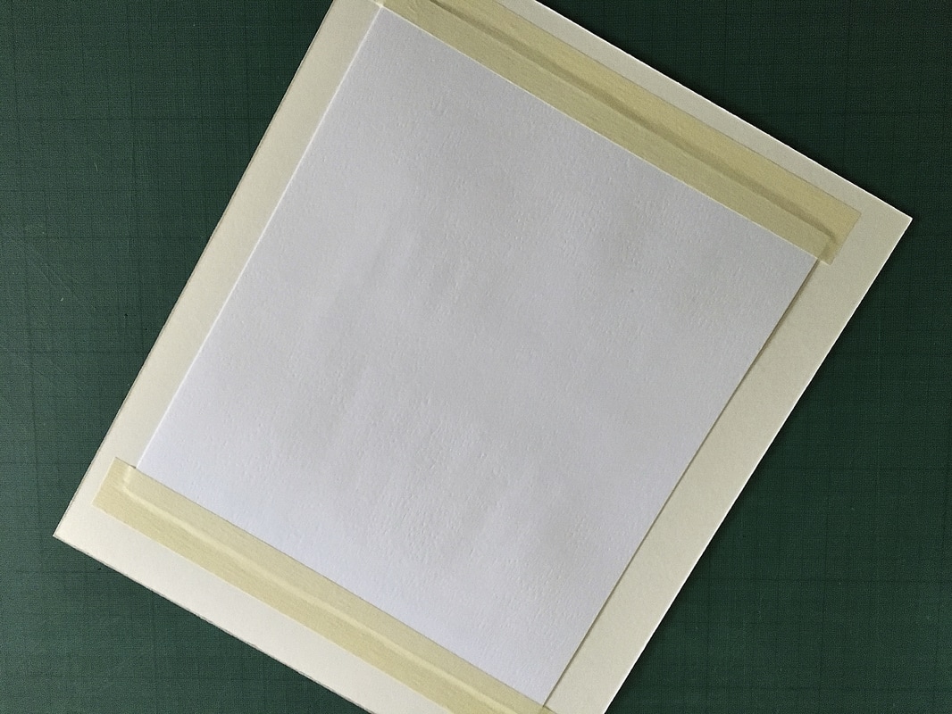
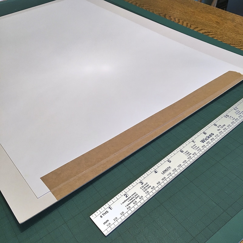
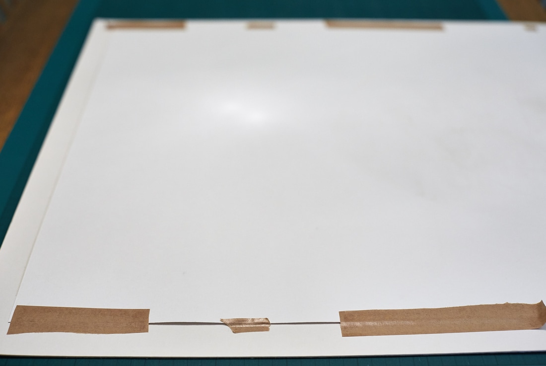
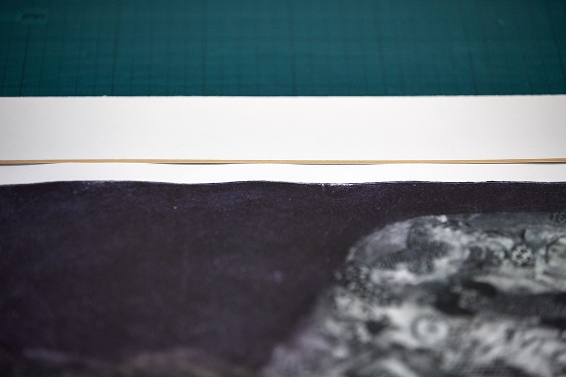
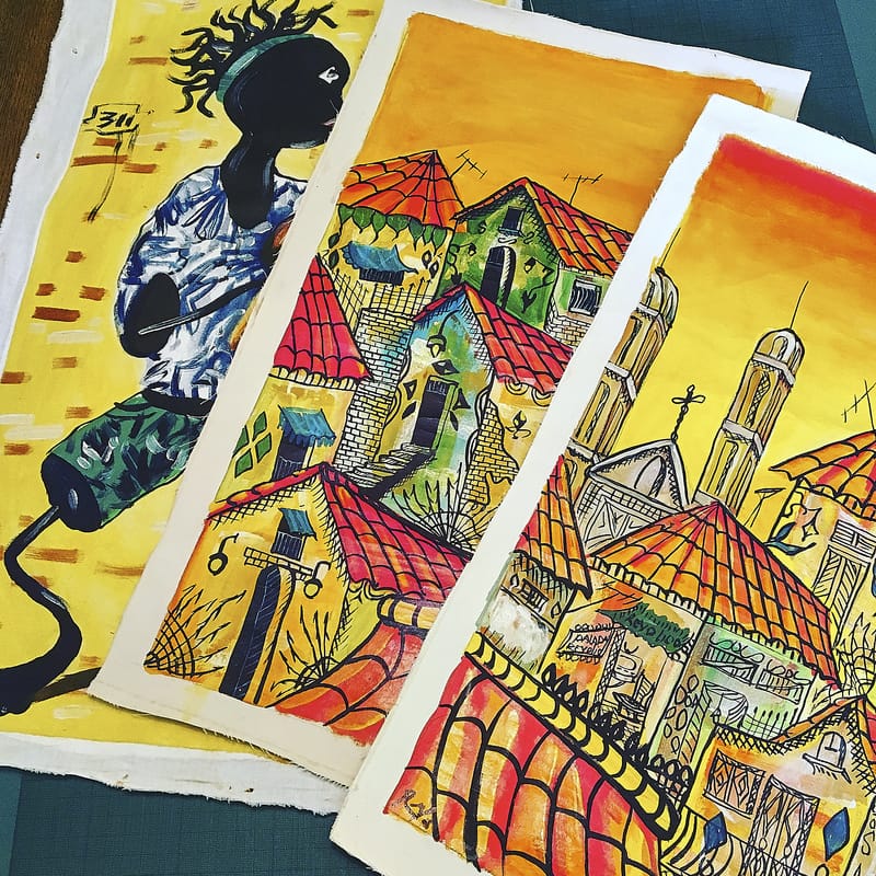
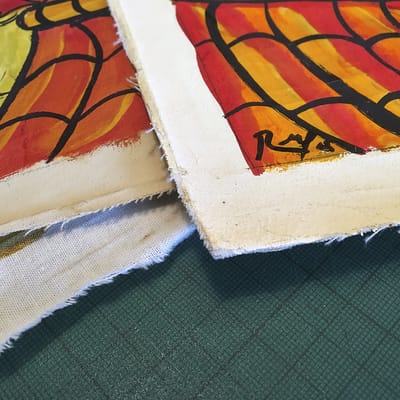
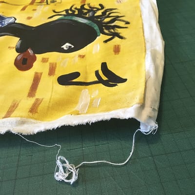
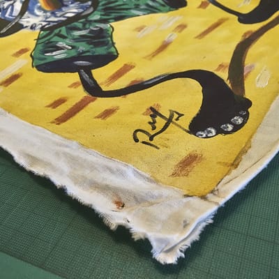
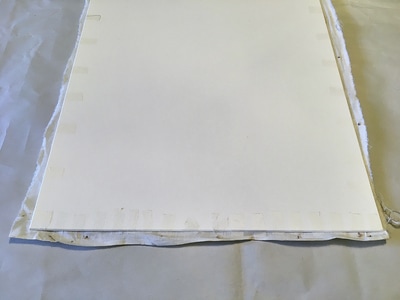
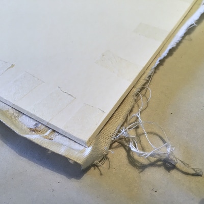
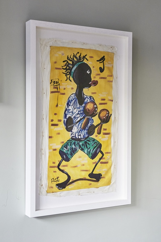
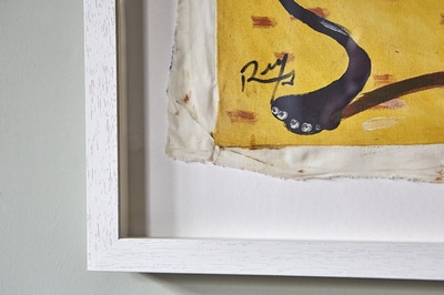
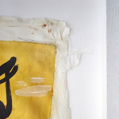
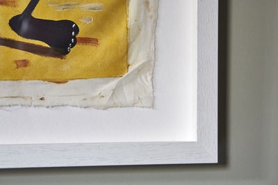
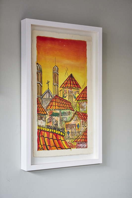
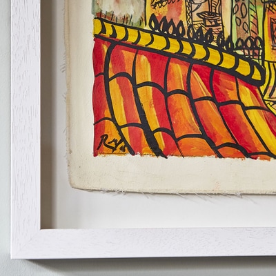
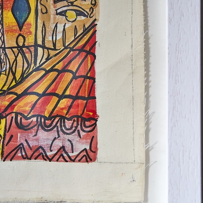
The two worst crimes against art, in respect to framing, is putting the work right next to the glass (I'll talk about that in another post) and bad hinging which I'll explain in this post. The print above has been hinged using masking tape at the top and bottom, not only will that mean that the print can't naturally expand and contract, the tape will eventually damage the print as it has no acid-free qualities. It's also impossible to know if any of the bad stuff will remain on the print after removal. My guess is that it's unlikely every trace of 'masking tape abomination' will be gone. Now, if you have a cheap print, that isn't particularly important, or it's one you can easily reprint then by all means stick it with whatever you like, in any way you fancy! But if it's a limited edition original work or something important you can't reprint then it needs to be hinged correctly to give the piece a chance to move around in its mount in reaction to changes in humidity and temperature. Many people hinge artworks with pressure sensitive 'acid free' tape, and while this isn't the worst thing that could happen to an artwork or photograph, I almost always use either archival gummed paper or Japanese paper hinges with freshly made wheat starch paste. This is because both are reversible using only water. Pressure sensitive or contact tape provides a much stronger hinge, but is notoriously difficult to reverse successfully. I always look at it like this... the hinge has to be strong enough to hold, but weak enough to break! I'd rather a customer brought a frame back because the hinge failed at some point in the future than bring back a piece where the hinge has been so strong and has stayed intact and the image/artwork has been torn or destroyed if, for instance, the frame was dropped. This example looks better on face value as the work has been hinged at the top only. Two things are, however, wrong with this. Firstly the hinge is far too big and strong, I would mount this with two very small hinges. Secondly, I couldn't remove this tape as I feared I would damage the art, so I cut it out, left it on the art and re-hinged it. I had no idea what was in the tape so it could damage the art but, on balance, thought it better to leave it where it was rather than risk damaging through removal. These are all examples of bad practices but the picture above was probably the worst I've seen. And it was a crime perpetrated by a 'framer' It looked bad when I took it out of it's original frame. The tape you can see wasn't top and bottom (which would have been bad enough) but at intervals on either side. This meant that rather than the print hanging from the top of the mount the weight of it made it concertina within the mount, you can see the result below. Unbelievably, this wasn't the worst of it. it was also taped into the mount at the top and bottom using double-sided tape... Sometimes I despair! It's a beautiful limited edition (of 30) print that should have been treated with great respect and love, but as it is it may never completely recover from it's mistreatment. I've done the best I can for it though. A client recently brought these 3 pieces of Cuban street art to be framed. His girlfriend had bought them years ago, he knew she loved them so thought they would make a great Christmas present. We discussed various framing options, the first being to window mount them. I was of the opinion that it would spoil the feel of the pieces, roughly cut canvas and cotton material (in the case of the portrait). My client agreed! Therse's a certain charm in being able to see the whole of an art work, with these you can see pencil marks to outline the border of the picture, the frayed edges, loose threds and even, in the portrait, staple holes where it was once seemingly attached to a wooden stretcher. So we decided they should be float mounted. Float mounting is great for this sort of art and gives the impression of the piece hovering in the frame rather than peaking through a window mount. It also works brilliantly for artworks which go right out to the edge and pieces where the paper that is rough cut or has nice textured edge. The two street scenes were pretty straight forward as they were fairly rigid due to the thickness of the paint. They were floated on acid free mountboard using linen hinging tape and then attached to some acid free foam core board to lift them away from the background. The portrait was slightly trickier because it was much thinner and wouldn't sit flat properly as it had been streched earlier in it's life when it was on a wooden stretcher. If I floated it in the same style as the others I would be able to see the hinging tape from the front and it would flop about. Not ideal! So I used very thin hinging tissue which virtually disappears and flush floated it so it sat flat on the backing mountboard. It was hard to know whether it would look right when the floating process was complete because, obviously, it has to be done with the artwork facing down due to the many kinks and lumps that were in the fabric! Thankfully it looked fine when I turned it over. Because of the very colourful nature of these works we decided to frame them with a simple, deep rebated, white frame, it's often nice to pick out a colour from a piece of art and tie the framing to it with either the mountboard or the frame moulding, but there's far too much colour and too much going on to do anything but simple with these.
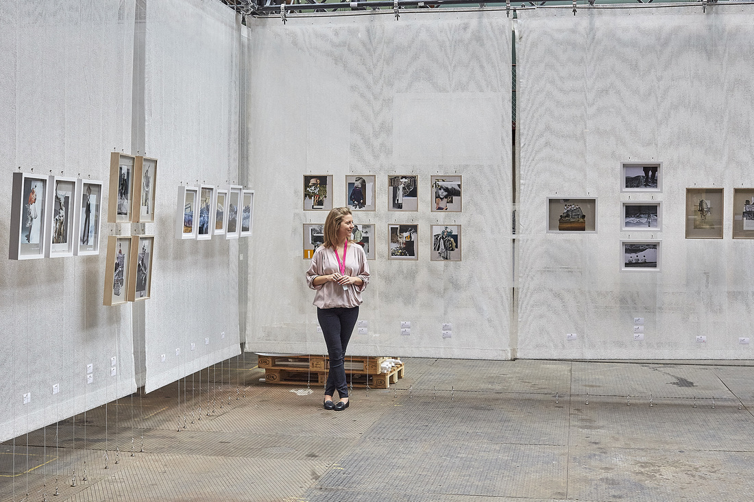
Below you can see the finished frames and I hope you agree that they work very well. They were certainly a great joy to work on! This is Linda Bernhard (visit her website here) and these are the frames I made for her for the Jungkunst exhibition in Winterthur, near Zurich, Switzerland. All of the work is paper collage on greyboard of a variety of thickness. The white frames were pretty straight forward, the collages were float mounted onto backing mountboard and framed. The plywood frames were not so straightforward but a joy to make...
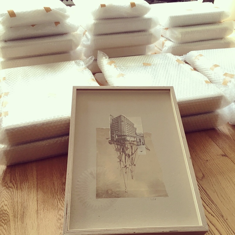
So how did we get to the hanging (not me, the frames!) point? Well, when Linda first came to see me with her work, she mentioned that she had asked a couple of framers if they could make her some plywood frames and they said it wasn't possible. I had other ideas and having long loved the decorative rather than the practical properties of plywood I said I'd give it a go. Firstly we had to work out the depth of the frame and, most importantly, where the glass and collage were going to be situated within it. Then, how to realise this! After several experiments with a local carpenter who has some great tools we eventually got the depth of groove right. It couldn't be too deep or the lip would snap in the Morso mitre cutter nor too shallow as it meant there just wasn't enough tolerance to make everything fit nicely together. The Goldilocks groove! Once this was worked out, it was a case of precision cutting, an OCD approach to dust removal (just sliding the glass into its groove created tiny particles...) and belief! It all turned out fine in the end, the last thing to do was wrap them to within an inch of their lives for the overland journey to Switzerland.... |
Archives
February 2022
Categories
All
|


 RSS Feed